top of page
Project Gallery
Visual highlights from our projects

01
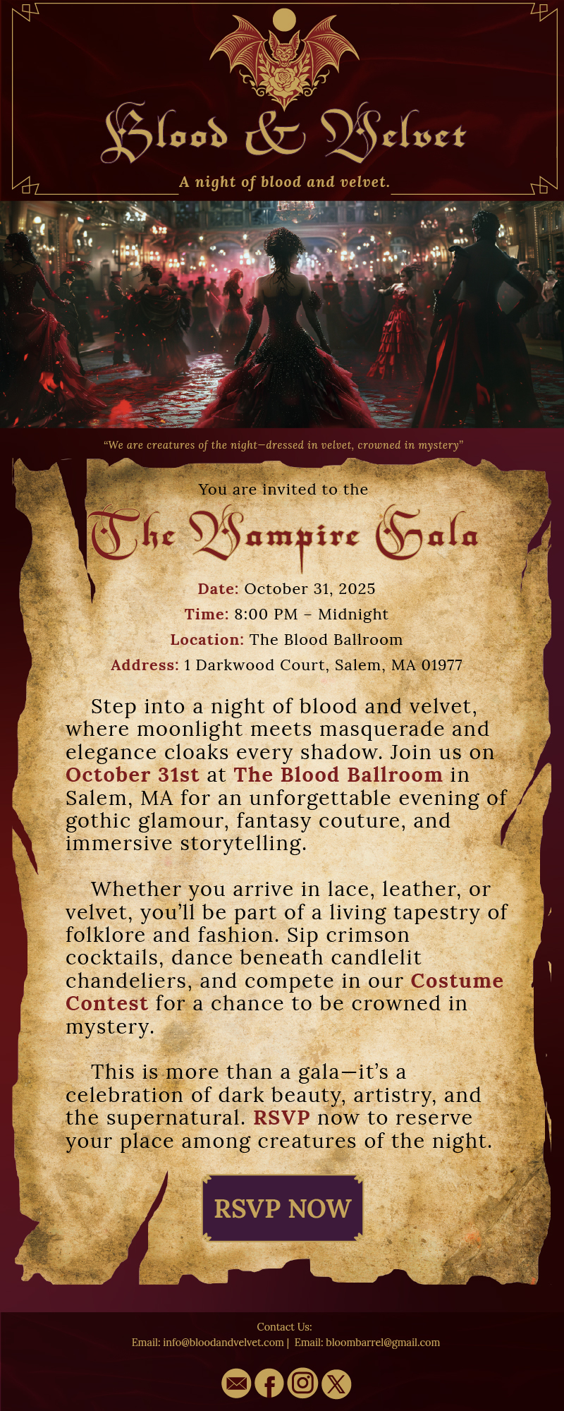
Blood & Velvet Vampire Gala
This project highlights my ability to create cohesive digital campaigns that
balance thematic storytelling with professional marketing strategy. By
blending gothic motifs, bold typography, and clear CTAs, the banners and
newsletter successfully conveyed the event’s atmosphere while maintaining
clarity and usability. It demonstrates my skill in adapting brand identity across
multiple digital platforms to achieve audience engagement.

02
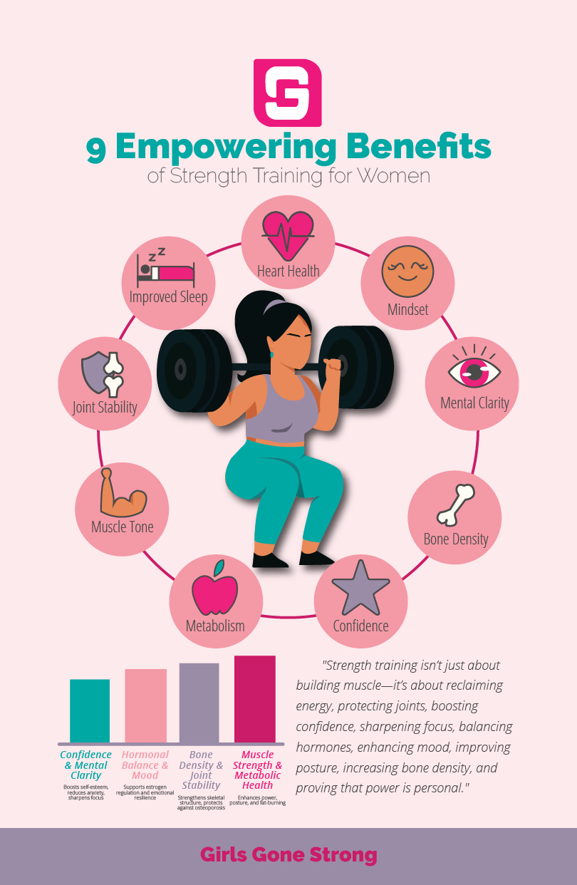
Girls Gone Strong
This infographic demonstrates my ability to merge health
education with compelling design. By organizing benefits into
categories such as confidence, hormonal balance, bone density,
and metabolic health, the poster communicates both physical and
mental advantages in a visually engaging way. It highlights my
strength in vector illustration, typographic clarity, and
audience-focused storytelling.

03
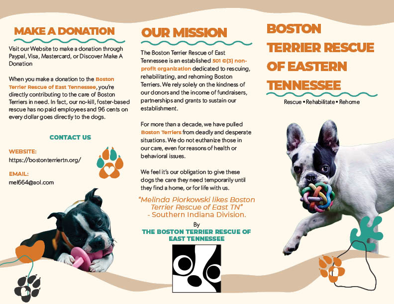
Boston Terrier Rescue of Eastern Tennessee
This brochure showcases my ability to design for nonprofit organizations, balancing heartfelt storytelling with structured communication. By integrating the mission statement, donation instructions, featured dog profiles, and even a branded recipe section, the piece reflects both creativity and professionalism. It demonstrates my skill in creating accessible, audience‑focused print materials that strengthen community engagement and donor trust.

04
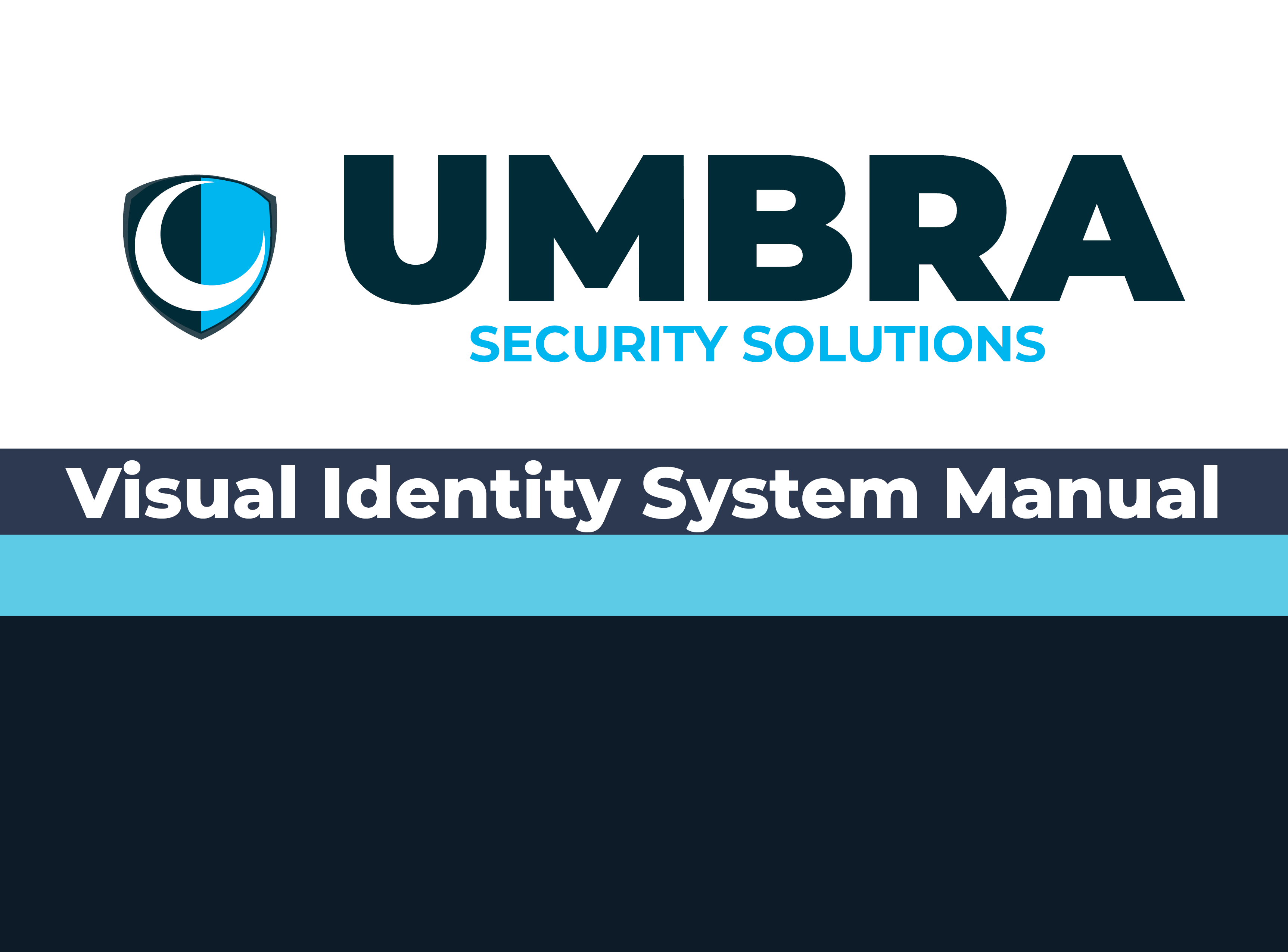
Umbra Security Solutions VIS Manuel
This Visual Identity System demonstrates my ability to create a cohesive,
professional brand foundation through clear logo standards, color rules, typography,
and usage guidelines. It reflects strong design discipline, consistent visual
communication, and a scalable system that supports Umbra’s
reputation in the cybersecurity market.

05
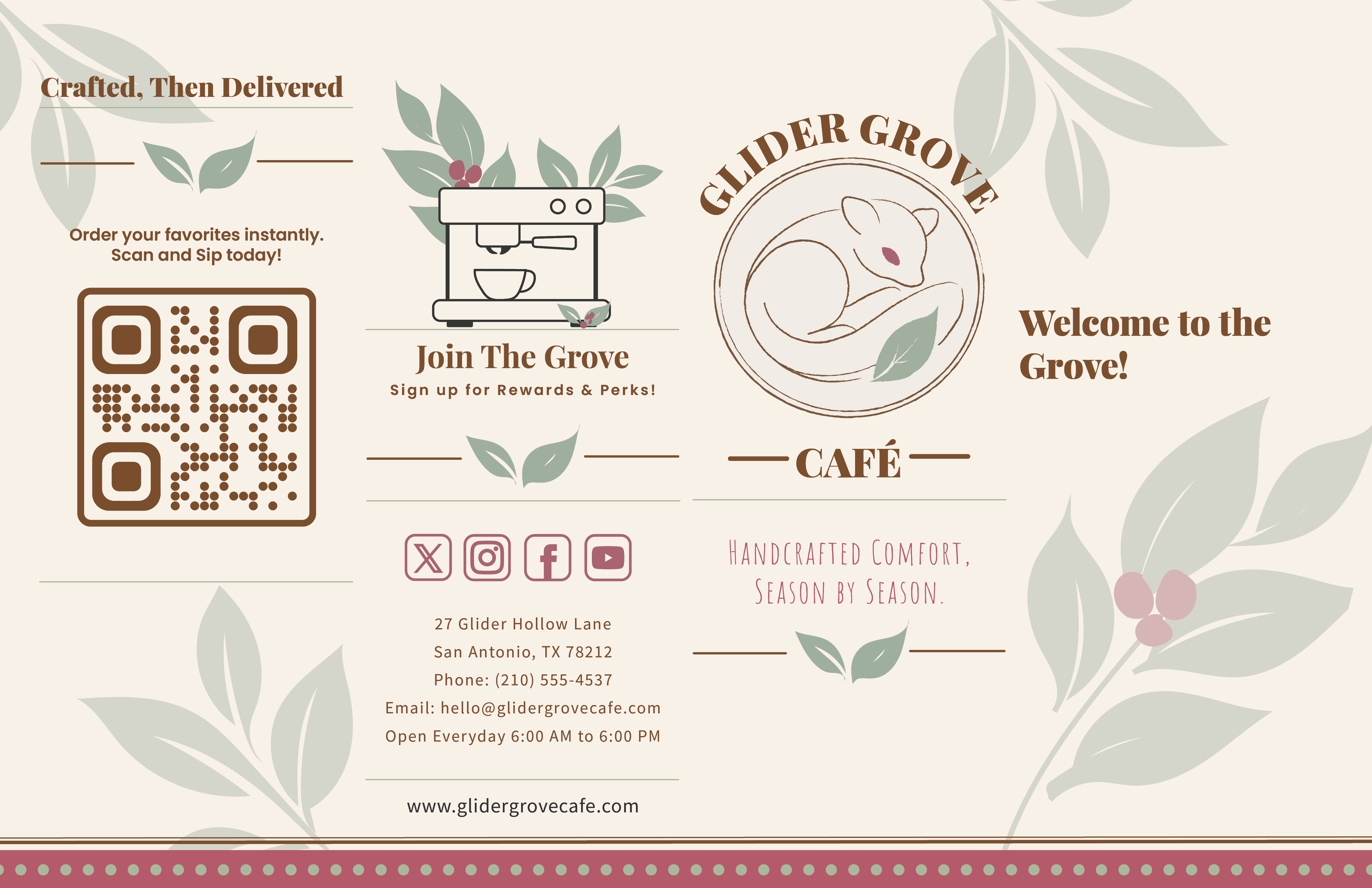
Glider Grove Cafe
This brochure showcases my ability to design for hospitality and
lifestyle brands, blending emotional resonance with structured,
accessible information. By integrating a mission statement, seasonal
flavor highlights, a featured drink, menu categories, and branded
iconography, the piece reflects both creativity and professional discipline.
It demonstrates my skill in crafting audience‑focused print materials that
elevate brand identity, guide customer experience,
and strengthen community connection.

06
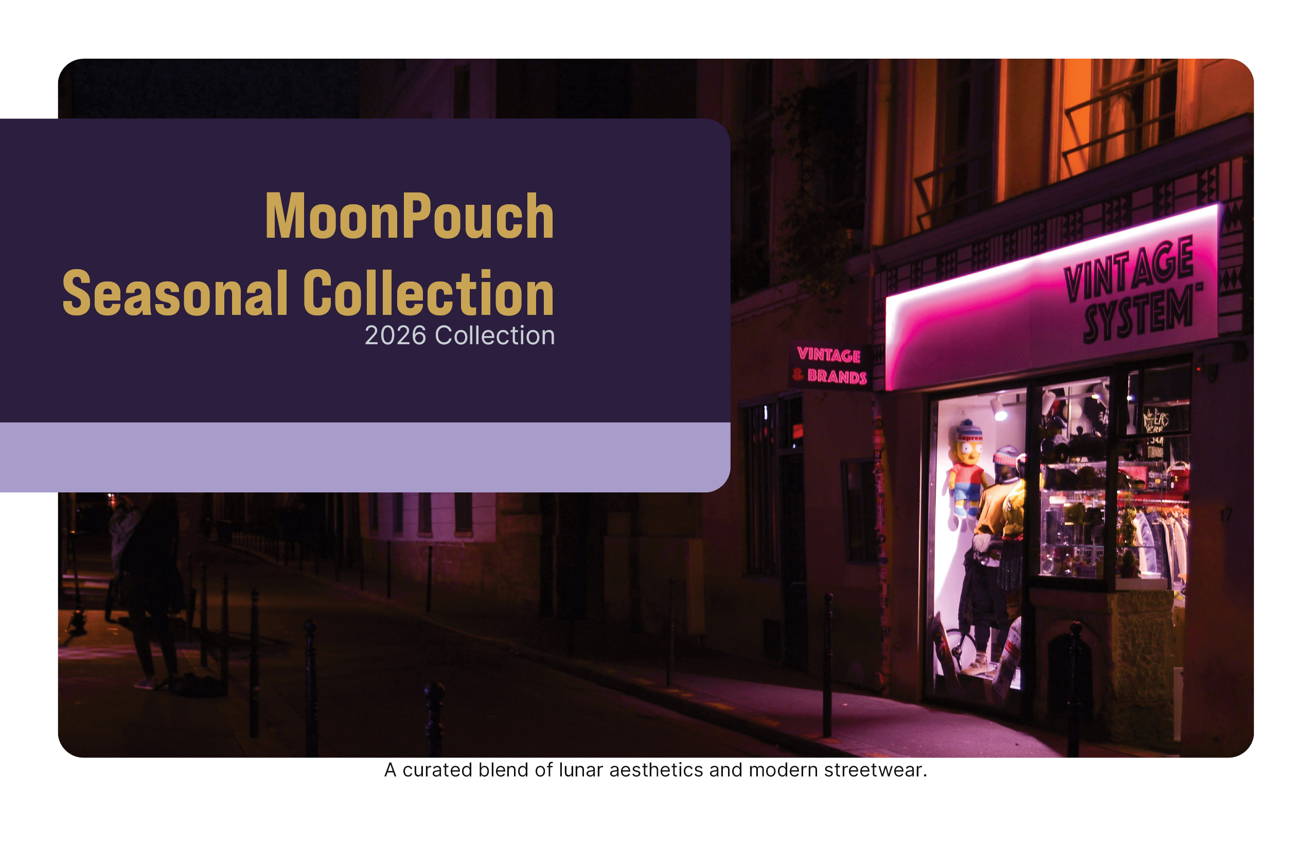
MoonPouch
This direct mailer showcases my ability to design for conceptual fashion brands,
balancing storytelling with structured communication. By integrating MoonPouch’s
mission statement, design philosophy, and product imagery, the piece reflects both
creativity and professionalism. It demonstrates my skill in crafting audience‑focused
print materials that translate abstract inspiration into tangible brand identity.
The project reinforces my understanding of how visual design can embody a narrative.
In this case, the calm, transformation, and individuality that define MoonPouch.

07
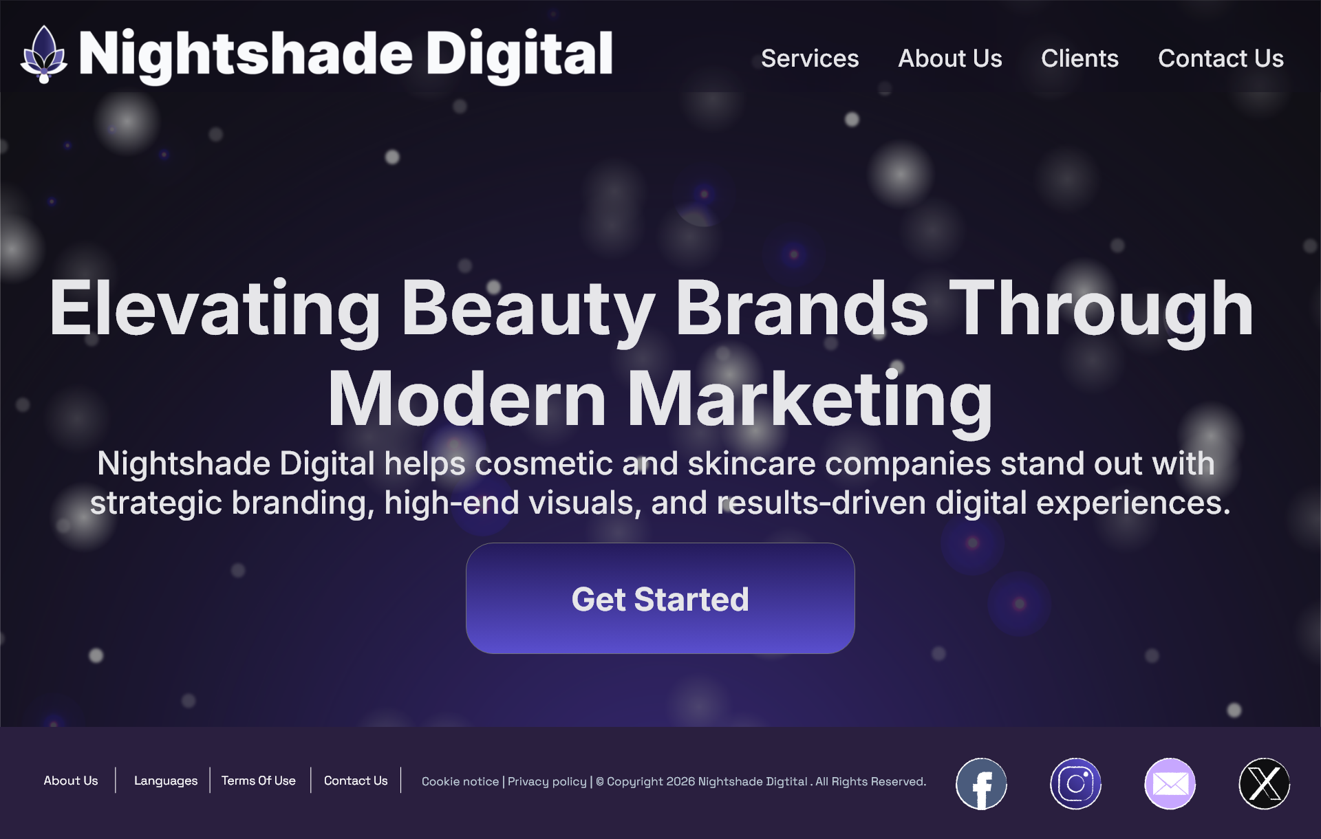
Nightshade Digital
This website project showcases my ability to design for niche
marketing companies within the beauty and cosmetic space.
By integrating structured service sections, product‑focused visuals,
and clean UI elements, the site maintains Nightshade Digital’s
signature style while appealing to a beauty‑oriented audience.
It reflects my skill in creating accessible, visually cohesive
digital experiences that strengthen brand identity
and support industry‑specific marketing goals.

08
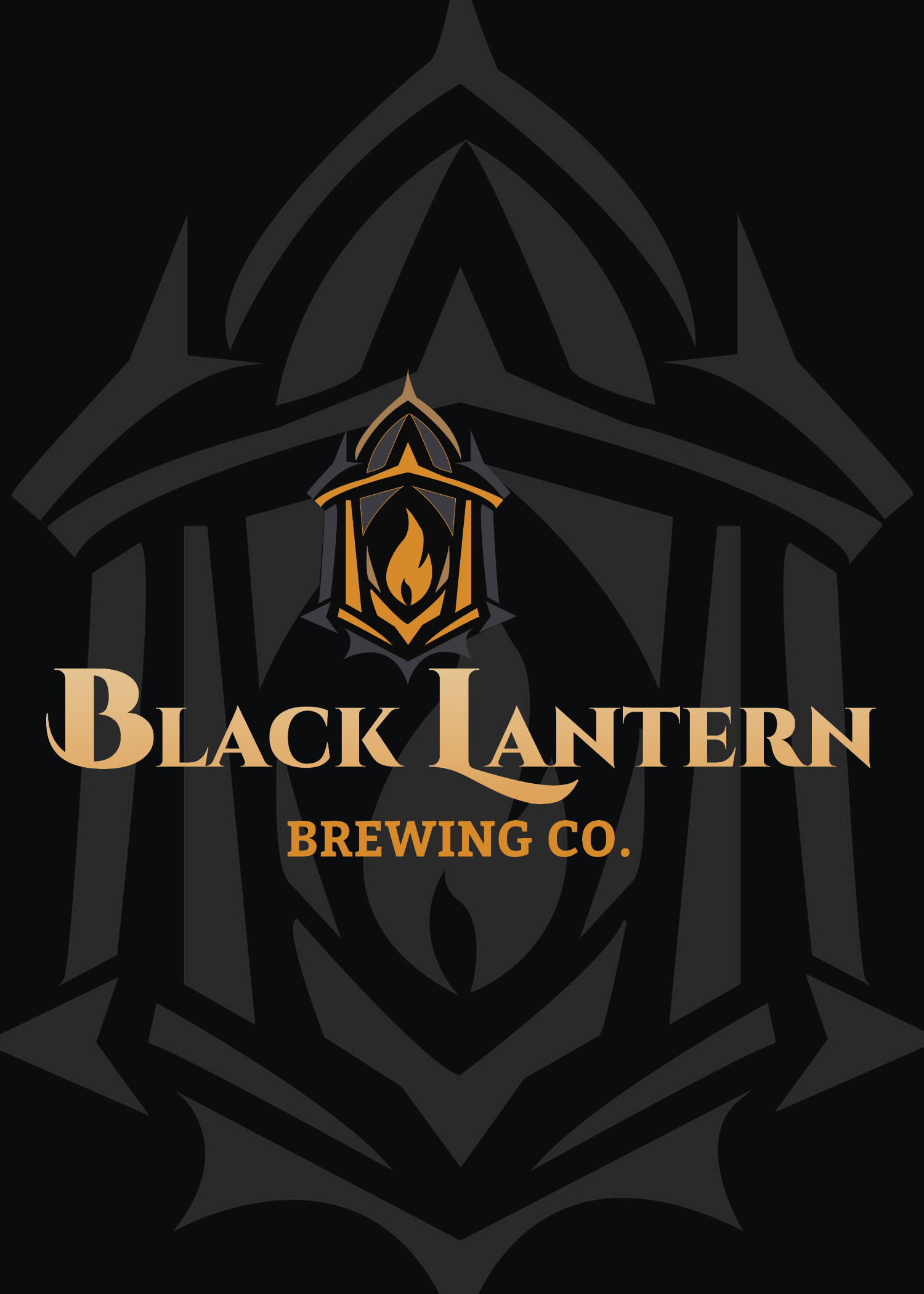
Black Lantern Brewing Co.
Black Lantern Brewing Company’s brand system was designed to capture a dark, atmospheric craft‑brew identity through a modern lantern emblem, bold typography, and moody textures. The logo establishes a strong visual foundation with its stylized lantern and custom wordmark, while the menu, table tent, and insert extend the brand across customer touchpoints using high‑contrast layouts, warm highlights, and clear, structured information. Together, these pieces create a cohesive visual experience that reflects the brewery’s character, enhances in‑taproom engagement, and strengthens brand storytelling across print and promotional materials.

09
Skåld Soda Co
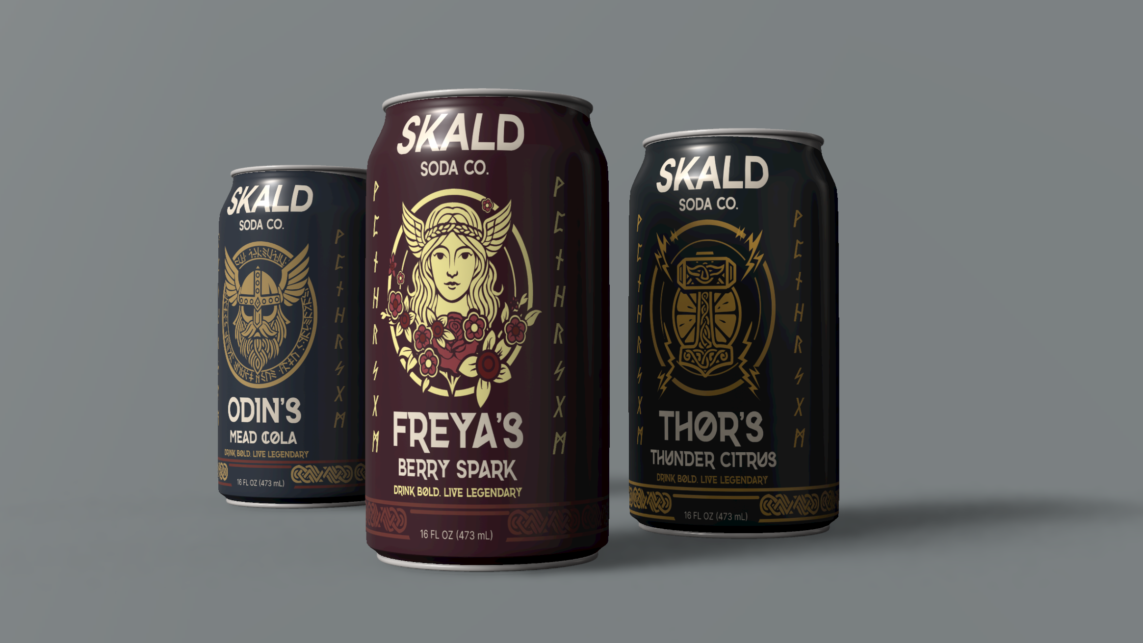
Skåld Soda Co. features a bright, playful brand identity inspired by Scandinavian minimalism and clean, modern design. The logo combines simple geometric forms with a friendly, uplifting character that reflects the brand’s focus on refreshing, natural flavors. Each can label builds on this aesthetic through bold color palettes, crisp typography, and clear flavor‑driven visuals that make the product instantly recognizable on the shelf. Together, the logo and label system create a cohesive, energetic brand presence that communicates Skåld Soda Co.’s personality while maintaining strong visual consistency across all packaging.

10
World Wildlife Fund Newsletter
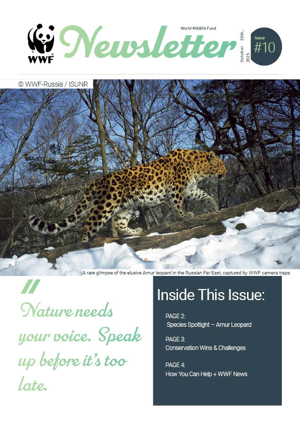
The WWF newsletter was designed to communicate environmental advocacy with clarity, impact, and strong visual hierarchy. The layout uses clean typography, structured sections, and engaging imagery to highlight conservation stories, wildlife protection efforts, and calls to action. A balanced mix of bold headlines, informative body copy, and accessible design elements ensures the content is easy to read while maintaining the organization’s recognizable visual identity. Overall, the newsletter delivers a polished, mission‑driven communication piece that supports WWF’s commitment to education, awareness, and global conservation.
01 / 10
Blood & Velvet Vampire Gala
This project highlights my ability to create cohesive digital campaigns that
balance thematic storytelling with professional marketing strategy. By
blending gothic motifs, bold typography, and clear CTAs, the banners and
newsletter successfully conveyed the event’s atmosphere while maintaining
clarity and usability. It demonstrates my skill in adapting brand identity across
multiple digital platforms to achieve audience engagement.
01
Blood & Velvet Vampire Gala
This project highlights my ability to create cohesive digital campaigns that
balance thematic storytelling with professional marketing strategy. By
blending gothic motifs, bold typography, and clear CTAs, the banners and
newsletter successfully conveyed the event’s atmosphere while maintaining
clarity and usability. It demonstrates my skill in adapting brand identity across
multiple digital platforms to achieve audience engagement.
02
Girls Gone Strong
This infographic demonstrates my ability to merge health
education with compelling design. By organizing benefits into
categories such as confidence, hormonal balance, bone density,
and metabolic health, the poster communicates both physical and
mental advantages in a visually engaging way. It highlights my
strength in vector illustration, typographic clarity, and
audience-focused storytelling.
03
Boston Terrier Rescue of Eastern Tennessee
This brochure showcases my ability to design for nonprofit organizations, balancing heartfelt storytelling with structured communication. By integrating the mission statement, donation instructions, featured dog profiles, and even a branded recipe section, the piece reflects both creativity and professionalism. It demonstrates my skill in creating accessible, audience‑focused print materials that strengthen community engagement and donor trust.
04
Umbra Security Solutions VIS Manuel
This Visual Identity System demonstrates my ability to create a cohesive,
professional brand foundation through clear logo standards, color rules, typography,
and usage guidelines. It reflects strong design discipline, consistent visual
communication, and a scalable system that supports Umbra’s
reputation in the cybersecurity market.
05
Glider Grove Cafe
This brochure showcases my ability to design for hospitality and
lifestyle brands, blending emotional resonance with structured,
accessible information. By integrating a mission statement, seasonal
flavor highlights, a featured drink, menu categories, and branded
iconography, the piece reflects both creativity and professional discipline.
It demonstrates my skill in crafting audience‑focused print materials that
elevate brand identity, guide customer experience,
and strengthen community connection.
06
MoonPouch
This direct mailer showcases my ability to design for conceptual fashion brands,
balancing storytelling with structured communication. By integrating MoonPouch’s
mission statement, design philosophy, and product imagery, the piece reflects both
creativity and professionalism. It demonstrates my skill in crafting audience‑focused
print materials that translate abstract inspiration into tangible brand identity.
The project reinforces my understanding of how visual design can embody a narrative.
In this case, the calm, transformation, and individuality that define MoonPouch.
07
Nightshade Digital
This website project showcases my ability to design for niche
marketing companies within the beauty and cosmetic space.
By integrating structured service sections, product‑focused visuals,
and clean UI elements, the site maintains Nightshade Digital’s
signature style while appealing to a beauty‑oriented audience.
It reflects my skill in creating accessible, visually cohesive
digital experiences that strengthen brand identity
and support industry‑specific marketing goals.
08
Black Lantern Brewing Co.
Black Lantern Brewing Company’s brand system was designed to capture a dark, atmospheric craft‑brew identity through a modern lantern emblem, bold typography, and moody textures. The logo establishes a strong visual foundation with its stylized lantern and custom wordmark, while the menu, table tent, and insert extend the brand across customer touchpoints using high‑contrast layouts, warm highlights, and clear, structured information. Together, these pieces create a cohesive visual experience that reflects the brewery’s character, enhances in‑taproom engagement, and strengthens brand storytelling across print and promotional materials.
09
Skåld Soda Co
Skåld Soda Co. features a bright, playful brand identity inspired by Scandinavian minimalism and clean, modern design. The logo combines simple geometric forms with a friendly, uplifting character that reflects the brand’s focus on refreshing, natural flavors. Each can label builds on this aesthetic through bold color palettes, crisp typography, and clear flavor‑driven visuals that make the product instantly recognizable on the shelf. Together, the logo and label system create a cohesive, energetic brand presence that communicates Skåld Soda Co.’s personality while maintaining strong visual consistency across all packaging.
10
World Wildlife Fund Newsletter
The WWF newsletter was designed to communicate environmental advocacy with clarity, impact, and strong visual hierarchy. The layout uses clean typography, structured sections, and engaging imagery to highlight conservation stories, wildlife protection efforts, and calls to action. A balanced mix of bold headlines, informative body copy, and accessible design elements ensures the content is easy to read while maintaining the organization’s recognizable visual identity. Overall, the newsletter delivers a polished, mission‑driven communication piece that supports WWF’s commitment to education, awareness, and global conservation.
bottom of page